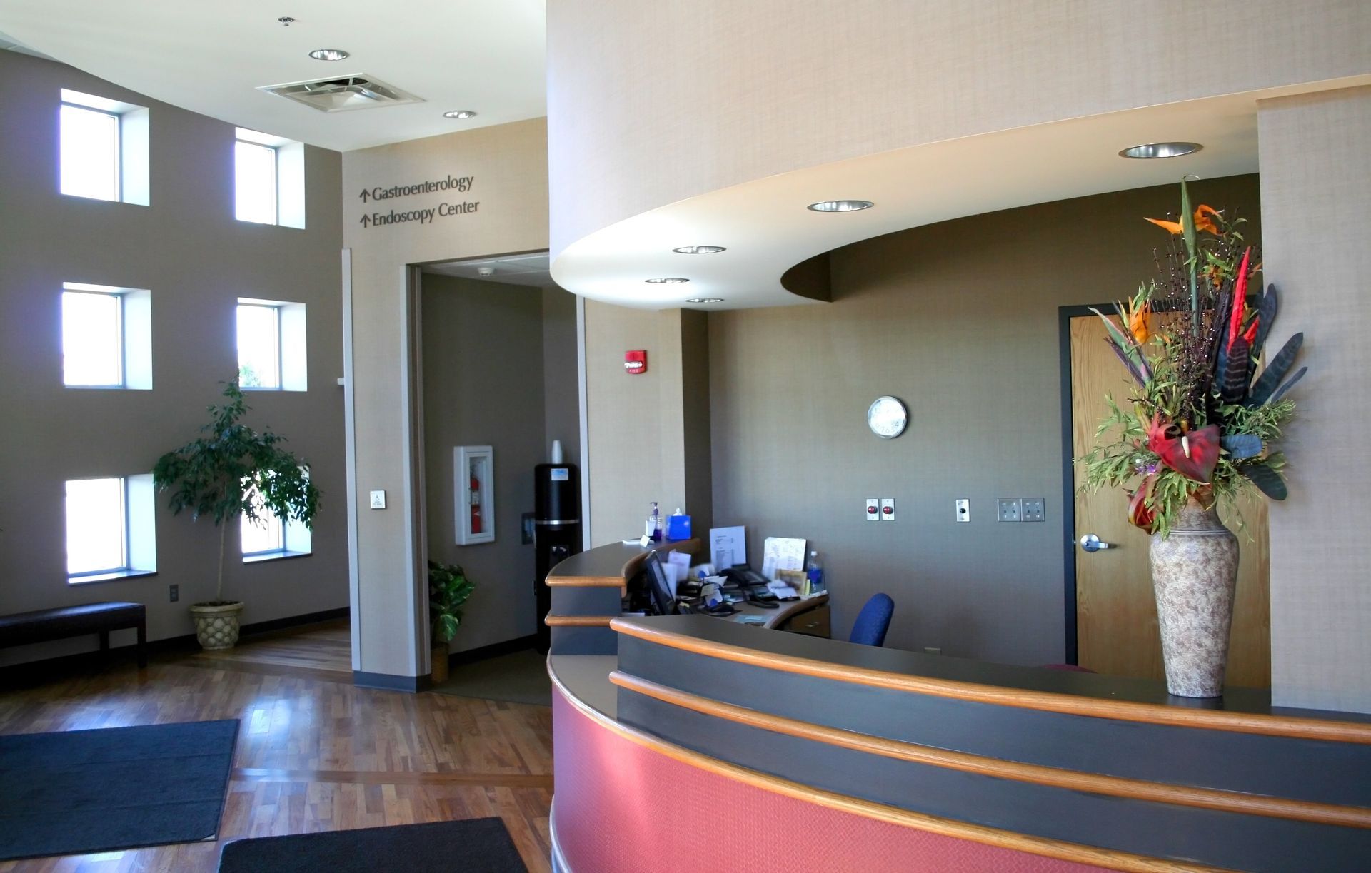
A visit to the doctor’s office can often be an anxious experience for patients. From the moment they step into the waiting room, the environment plays a significant role in shaping their comfort and perception of care. While much attention is given to functionality and cleanliness in medical spaces, the choice of colors is often overlooked despite its profound impact on patient emotions.
Color is more than just a design element—it’s a powerful tool that influences mood, reduces stress, and fosters a sense of trust. When carefully chosen, the right colors can create a calming atmosphere that helps patients feel at ease and confident in the care they’re receiving.
In this article, we’ll explore the psychology of color, how it affects emotions, and why selecting calming and professional tones for your medical office can enhance patient comfort. Whether you’re designing a new space or updating an existing one, understanding the role of color in patient experience is key to creating a welcoming environment.
The Psychology of Color in Medical Spaces
Colors have a powerful psychological effect on people, influencing their emotions, perceptions, and even physical responses. In medical offices, where patients may already feel stressed or anxious, the choice of colors can significantly impact how they feel during their visit. By understanding the emotional cues tied to different colors, you can create a space that promotes calmness, trust, and well-being.
How Colors Affect Emotions
- Blue: Known for its calming and serene qualities, blue is a popular choice in medical offices. It evokes feelings of trust and reliability, making it ideal for waiting rooms and exam rooms where patients need reassurance.
- Green: Symbolizing health, balance, and renewal, green has a soothing effect on the mind and body. It’s an excellent choice for spaces where you want to emphasize wellness and relaxation, such as consultation rooms.
- White: While white represents cleanliness and professionalism, overuse can make a space feel cold and uninviting. Pairing white with softer tones can balance its starkness.
- Yellow: A touch of yellow can add warmth and optimism, but it should be used sparingly as an accent to avoid overwhelming the senses.
- Gray and Neutral Tones: Subtle and sophisticated, neutral shades are versatile and create a professional, polished look without being too stark or distracting.
Colors to Avoid
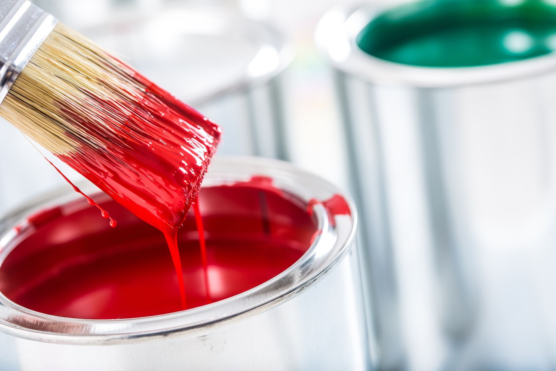
- Red: While bold and attention-grabbing, red is linked to heightened energy and emotions, which can increase feelings of anxiety in patients.
- Overly Dark Tones: Deep, dark shades can make a space feel heavy and uninviting, which is counterproductive in a medical setting.
Real-World Impact of Color Choices
Imagine a waiting room painted in cool blues and soft greens, accented with natural wood tones. Patients entering this space are more likely to feel calm and cared for, setting a positive tone for their visit. In contrast, a stark white or overly dark waiting room might leave patients feeling uneasy or disconnected. These subtle design choices influence not only patient satisfaction but also their overall perception of the care they receive.
Tips for Choosing Colors for Medical Offices
Selecting the right colors for your medical office requires careful consideration of the function and flow of each space. By tailoring your color choices to specific areas, you can create an environment that is both calming for patients and professional for staff.
1. Consider the Function of Each Space
- Waiting Rooms: These spaces should be calming and inviting to help ease patient anxiety. Opt for soft blues or greens paired with neutral tones to create a serene atmosphere that sets the tone for the visit.
- Exam Rooms: Use light, neutral shades like soft gray or pale green to maintain a clean and professional feel while avoiding the sterility of all-white walls.
- Offices and Staff Areas: For administrative or back-office spaces, consider energizing yet balanced colors like muted yellows or warm grays to promote productivity and focus.
- Hallways and High-Traffic Areas: Neutral tones with durable finishes are best here to maintain a professional look while standing up to wear and tear.
2. Create a Cohesive Palette
Maintaining a consistent color scheme throughout the office ensures the space feels unified and professional. Choose a few base colors and incorporate complementary accents for variety without overwhelming the senses.
3. Incorporate Branding Colors
If your medical practice has established branding, subtly incorporate those colors into your design. For example, a logo color could be used as an accent on one wall or in decorative elements to tie the design together without dominating the space.
4. Prioritize Low-VOC Paints
Medical offices require a safe, healthy environment for patients and staff. Using low-VOC (volatile organic compound) paints ensures good indoor air quality and minimizes odors, an essential consideration for healthcare spaces.
5. Consult a Professional Painter
Choosing colors and finishes can be overwhelming, especially for a medical office with unique needs. Working with a professional office painter ensures you get expert advice on color schemes, finishes, and application techniques tailored to your specific space.
Why the Right Colors Improve Patient Comfort
The colors you choose for your medical office go beyond aesthetics—they play a vital role in shaping the experience of your patients and staff. By creating a space that feels calming and professional, you can enhance patient satisfaction, foster trust, and support a productive work environment.
Reduces Stress and Anxiety
Colors like soft blues and greens help to lower stress levels and create a sense of calm. For many patients, a visit to the doctor can be an anxious experience, and the right color palette can make the environment feel less intimidating and more welcoming. Warm neutrals and gentle hues can further add to the sense of relaxation.
Enhances Perception of Care
The visual appeal of your office significantly impacts how patients perceive the quality of care. A thoughtfully designed space with harmonious colors signals professionalism, attention to detail, and a commitment to patient well-being. This positive first impression can improve trust and confidence in your practice.
Supports Staff Productivity
Your staff’s comfort and efficiency are equally important. Balanced, energizing colors in back-office areas and break rooms can promote focus and uplift moods during long workdays. By creating a supportive environment for your team, you indirectly improve the patient experience as well.
Creates a Sense of Comfort
When your medical office feels inviting and thoughtfully designed, patients feel more at ease. This comfort can make appointments less stressful and even encourage patients to be more engaged in their care.
Create a Healing Environment with the Right Colors
Your medical office is more than just a place of work—it’s a space where patients seek comfort, care, and healing. By choosing the right colors, you can create an atmosphere that calms anxious nerves, boosts trust, and fosters a positive experience for everyone who visits. From soothing blues and greens in patient-facing areas to energizing tones in staff spaces, every color choice plays a role in creating a supportive and professional environment.
Transform Your Medical Office with Pioneer Painters
At Pioneer Painters, we specialize in creating spaces that inspire confidence and comfort. Our expert team offers professional interior painting services tailored to medical offices throughout Western Massachusetts and Northern CT, including Longmeadow, Springfield, Enfield, Suffield and beyond. From helping you select the perfect color palette to applying durable, low-VOC finishes, we’ll ensure your office reflects the highest standards of care. Contact us today for a consultation and let us help transform your medical office into a space that patients and staff will love!
Recent Blogs


Get A Fast Quote Online
Have a painting project you need a quote for? Submit a fast and easy quote request online